“Case Study- Pivoting to Save a Doomed UX

How I pivoted twice to deliver a frictionless expense experience, transforming a failed invisible UI into an intuitive AI-powered solution
In the summer of 2000, I drew the unwanted attention of the Lebanese military. I hadn’t done anything deserving scrutiny, but in a place like Beirut, I knew that anything was possible. I was detained and brought to a room where I was peppered with questions while my possessions were examined. After a short time, I was informed that my camera and film would be confiscated, with the open implication that I would be charged with a crime.
My passive compliance was not helping, so I took a chance and pivoted to something completely different. I changed the conversation from one about me to one about a girl I knew back in DC. She had grown up in the war-torn city and inspired me to learn more about it on my own. I mentioned streets, nightclubs, and more that felt like it might resonate with the soldiers. It worked, and soon the three of us were chatting like old friends, the pair even recommending places I should see. The allowed me to keep my camera and my film, and a short time later I was free, once again walking along the balmy cliffs of the gleaming Mediterranean.

I got lucky, but learned that sometimes it’s better to swiftly change direction when the current course of action appears headed for a bad ending, even with no assurance that the new direction would get me to my destination any better.
The Challenge
When strategy meets constraints
Oracle’s first mobile-first finance product, Touchless Expenses, began with an ambitious vision: an intelligent system that would handle business expense issues like a personal assistant — quickly, concisely, and with minimal interruption. It was envisioned as a “concierge-like” experience that remained invisible until needed, a subtle assistant discovered through nudges and confirmations that users would discover naturally.
The design for guided resolution was elegant and innovative. The team had envisioned a chatbot interface with custom GUI cards presenting expense data through branded illustrations — enabling glanceable identification and fast recognition. The prototypes were compelling, and stakeholders were excited.
The First Pivot
Just before launch, the design was killed.
Executives had withdrawn support for extending the design system into the chat GUI, citing insufficient ROI to justify parallel development paths for the proprietary chat platform.
This created an immediate crisis. The product owner had previewed glimpses of this design to customers for years. Now we faced a critical question: How could we deliver the same low-friction, high-polish experience without the chat interface long imagined?
I was new to the team, but addressed the problem head-on. After rapid exploration, I proposed a compromise solution using existing components to create a “faux-card” experience that visually resembled our planned design, even if the interaction model differed. The gamble won executive approval, and we raced to flesh out all the design use cases needed for implementation.

A Cascade of Compromises
We successfully shipped on schedule, but several critical factors ultimately undermined our vision:
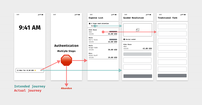
- Authentication Friction: Our process required a half-dozen steps or more, with users often needing to look up information or wait for responses — destroying the “tap and go” expectation of mobile apps and notifications.
- Platform Navigation Issues: Our app lived within a platform shell we didn’t control, forcing users to navigate additional interfaces before reaching our experience.
- Poor Discoverability: The in-app entry point to our guided resolution was merely an unembellished link in a page banner — easily overlooked and lacking visual priority.
- Linear Flow Limitations: Once the users were in the guided navigation flow, they were unable to skip items they couldn’t immediately resolve, creating frustrating dead-ends.
- Design System Tensions: The design system team viewed our creative component usage as an unacceptable deviation from guidelines.
Our initial user group — stakeholders familiar with these limitations — navigated these obstacles with understanding. This lack of critical usability feedback skewed our assessment of the problems’ severity, as we believed we could resolve them incrementally before we released to a larger user base.
Reality Check
As the product expanded to pilot users unfamiliar with its development, the flaws became impossible to ignore. Users:
- Abandoned authentication attempts after clicking push notifications
- Failed to discover the banner link
- Bypassed our guided flow entirely, clicking directly on flagged items — the path of least resistance
Our concierge concept wasn’t failing because users disliked it — most didn’t even know it existed. We had designed an idealistic sidewalk while watching real people carve their own path across the grass.
We still believed expense resolution could be simpler and more touchless. After all, we all used consumer apps that handled similar tasks with far less friction.
We had set out to eliminate friction but instead eliminated clarity.
What I did
Diagnosis and Insight
I led a comprehensive analysis combining qualitative interviews, product walkthroughs, and telemetry data. The diagnosis was clear: we faced a classic discoverability failure. The cues leading to our guided resolution were too subtle or entirely blocked by structural barriers and planned improvements to the design system components did not offer a way forward.
Most critically, our reimagined concierge model failed because users didn’t experience it as intelligent — they experienced it as absent. The burdensome authentication flows interrupted any momentum users might have built, making our elegant solution feel like yet another hurdle.
We should have anticipated how these compromises would dilute our vision. Only through deliberate investigation did we fully understand the causes and begin to see a viable path forward.
The Second Pivot
I recognized that incremental improvements wouldn’t bridge the gap to our vision. The barriers weren’t merely UX details — they were structural:
- Authentication complexity regularly blocked users at key moments
- Poor mobile component behavior meant contextual prompts sometimes misaligned or failed to render properly
- The “invisible assistant” model felt absent rather than helpful
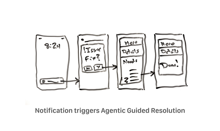
This forced a more fundamental conversation about our approach. Rather than retrofitting clarity into a touchless model that wasn’t working, I drove a strategic pivot: refocus our “concierge” experience around emerging generative AI capabilities, where the system could offer transparent, conversational resolution assistance in a way users immediately understood.
The recent surge of generative and agentic AI was already a strategic business priority, and the timing was perfect. We were already working on a simple assistant-like generative agent for another use case, so it wasn’t a stretch to reimagine how to extend or complement it with another agent focused on delivering that long-sought guided resolution experience.
Importantly, I also spearheaded an effort to reexamine our overall mobile user strategy in order to gain access to native APIs that would allow us to implement biometric authentication in order to eliminate the burdensome sign-in process, despite some incremental improvements by our securit organization.
Reframing the Vision
This shift wasn’t about abandoning the assistant model — it was about evolving it into something more accessible, visible, and trusted. I partnered with our product and design system leads to explore how a generative interface — rooted in user intent and natural language — could better fulfill our original goals.
Instead of trying to hide the system, we would invite users into a guided experience:
- A system that explains its actions instead of silently executing them
- A design that shows progress through conversational UI, not buried state transitions
- An engagement model that evolves over time without requiring constant retraining
This reframing aligns the product with both user expectations and technical feasibility, while maintaining our commitment to reducing manual effort.
The Outcome
A next step that aligns strategy with vision
While we are still hard at work realizing this vision, we’ve made a decisive move toward a more achievable future. Along the way, we’ve gained:
- A clear understanding of the limits of “invisible UX” in enterprise contexts
- Validation that users want automation — but need to understand, trust, and find it
- A design strategy aligned with the strengths of generative AI and emerging agentic systems
What began as a push for minimalism is evolving into something more human-centered: a smart, responsive assistant that users can see, understand, and trust.
We are not yet entirely sure what our final destination will look like or what obstacles will confront us, but we do know where we are headed as we set sail on this exciting voyage.

What I Learned
This project didn’t follow a typical success narrative — and that’s precisely what makes it valuable. It demonstrates strategic UX leadership: not just solving problems, but recognizing when a solution isn’t working and having the clarity to pivot.
Three key lessons emerged:
- Visibility trumps invisibility in complex enterprise contexts — users need to see and understand the system that’s helping them
- Authentication and platform constraints must be central to the design strategy, not treated as separate technical concerns
- User feedback from stakeholders isn’t representative of how typical users will experience your product
By grounding our approach in real user behavior and emerging technology capabilities, we’re building toward something better. Rather than forcing adoption of our original vision, we listened, adapted, and are leading with human-centered intent.
The measure of UX leadership isn’t always getting it right the first time. Sometimes it’s recognizing when to change course and having the courage to advocate for what users actually need, even when it means evolving your own vision. Yeah, and sometimes it’s about timing.